As part of our post-production feedback I got three friends to watch our teaser trailer and send me their opinions via BBM. As shown below the pasted the link to each of them and requested feeback. I chose to use the Blackberry Messenger software on Blackberry because it is a popular smartphone amongst the age groups of those 18+ which is our target audience for our teaser trailer. I use an application called Screen Muncher to capture the feedback that i was given.
Based on the feedback that I have received I believe that the teaser trailer worked really well especially the false finger cutting. It was a successful aspect within our trailer that came across and chilling and scary; the impacts that a horror teaser trailer are supposed to have.
Through our post-production feedback we learned that there was room for improvement within our trailer. We challenged a convention when we decided to use high key lighting but this may not have worked as effectively as we thought it would. Darkness instantly connotes fear and that is what horror is all about. I believe that is one of the area's that we could work on if we was to do the project again.
I also viewed the comments that was left on our youtube account in relation to our teaser trailer. Based on this information it was clear that the teaser trailer worked quite well but there where small areas in which other people had different opinions about. This is perfectally understand because everyone has a different expectation and standard of what they expect to see in a teaser trailer.
This was the reaction of one of my peers to our teaser trailer. The part where the finger was cut seems to be effective as a scare.
Elizabeth's response:
To gather my post production feedback from people about our groups film poster and magazine cover, I sent the following email to people to attaching a copy of these two media products.
I asked five females and five males all between the ages 17-20 but for this I will be evaluating four responses. Generally the feedback I got was positive and however there were some suggestions on how to make improvements in the future.
Here, the receipt says that he finds our pieces quite plain but he does think they look good and suitable to the horror genre. Funnily enough Jordan says he hasn’t seen a plain black background used on a film poster before and he thinks it worked well. Personally I am surprised that the black background was new to him as I would have thought that that was typical of horror film posters. Jordan goes on to say that he would go and see our film which is of course good to know.
Secondly, I have Sally’s response she also said she found our film poster quite plain however she did like the image used. She also said that our media products look suitable for the genre but she feels that unlike the film poster, there’s nothing really original about the magazine front cover. From Sally’s response to the final question it seems our accompanying teaser trailer would determine whether or not she’d go and see our movie as she does not seem fully convinced.
The feedback received from my next participant was generally very good. Emmanuel found the use of red on our media products ‘really eye catching’. He thought our pieces looked suitable for the horror genre and that we never broke and conventions of similar products out there. Emmanuel is as well interested to see what our teaser and film have to offer.
Last but not the least, the fourth respondent I will be analysing is Yasmin. She gave some positive feedback too and she too does not think we broke any conventions.
Above is a spider diagram of our groups title ideas for our horror film, we brainstormed all of our film title ideas and collectively decided to use 'A Beautiful Nightmare' for our film title because we thought it was the most appealing and appropriate title for our film.
Evaluation question 1: In what ways does your media production use, develop or challenge forms and conventions of real media products?
Elizabeth's response
At the start of this academic year we were assigned groups and given three tasks as part of our A level coursework. Between us we had to construct a teaser trailer, film poster and front cover of a magazine all of the horror genre. Our group decided to explore the slasher horror genre. Popular films of the slasher genre include the SAW sequels, Nightmare on Elm Street and Scream.
First and foremost, teaser trailers are simply short trailers that are made to 'tease' the audience. These teaser trailers are used to market an upcoming film (or a number of other media) usually released long in advance of the final media product. Teaser trailers generally last between 30-60 seconds and they usually contain little to no footage from the film. They are created to stir a buzz about the film whereas actual trailers give you more of an idea of what the film will be like.
Before creating our horror film teaser trailer there were a number of things to take into consideration. Firstly, we brainstormed different ideas and then when we had decided on a story line, a storyboard was constructed. After we decided on which of our group members would act in our teaser trailer then when we got hold of the required props we then filmed. As we anticipated, at first filming wasn't as easy as it seemed particularly getting the lighting right. To give us an idea of the type of trailers that are most successful we looked at a number of trailers via YouTube. By looking at these examples we got an idea of what elements worked best in trailers. Taking the SAW 3D teaser trailer for example, it was 57 seconds long which means it kept within the conventional time frames of teaser trailers. This teaser trailer consists of a large number of quick cuts, fades in and out, close up shots to name but a few. The deep, sinister tone of the voice over helps set the horrific tone.
The film poster we constructed
The poster that was constructed for our coursework stuck to a few conventions of real media products however it also broke a few. Across the top of our movie poster is the tagline for our movie which is 'dreams can come true'. This tag line relates well with the title of our horror project 'A Beautiful Nightmare'. The colours used are also suitable to the genre of film we were working on as red, black and grey are colours that can be related to the horror genre. Similarly, the same red colour that was used for the tag line is also used for the posters masthead, working effectively to create an authentic look. The font used for the masthead is called '...' and it was selected and downloaded from Dafont.com after careful deliberation. It seemed like this particular font was most suitable as the effect on it made it look like blood dripping. This font is similar to that of the 'Nightmare on Elm Street' one. The main image is of a young female victim who is being muffled from behind and therefore enforces her vulnerability and helpless predicament. We don't even have to be told that the person doing the muffling (the killer) is a man. This is another convention we upheld as in horror movies the majority of the women tend to be portrayed as helpless and senseless individuals, even the pose of the victim connotes this. Our teaser trailer does not back up the convention of slashers as the survivor is often female like in the movie Halloween and the killer is a single male for instance in My Bloody Valentine.
Movie poster of 'My Bloody Valentine' (2009)
A print screen from the trailer of the killer from 'My Bloody Valentine'
Along the bottom third of the poster, there is a billing block/credits which gives acknowledgment to the media companies that had a big impact on the film and also the names of the actors. Also under the credits instead of actually stating a film release date we chose 'COMING SOON' has been put in a big font right in the centre which draws some attention to it. In the bottom right hand corner of the poster we put the production company's logo and this is definitely a convention of film posters.
Right under 'COMING SOON' at the bottom of the poster, the website of the movie poster has been inserted and this is also another convention we upheld.
Websites from the movie posters of 'Paranormal Activity 3' and 'I Am Legend'
By adding the website of a movie, it can allow people to get more information on the movie in more of an interactive way. The movie trailer will be available on the website as well as photo galleries and general information on the movie.
The film magazine front cover we constructed
One thing we never did was have the victim covered in blood in our poster or film magazine front cover but in the actual trailer we used "blood" as it would not have been of the slasher genre without it. To make up for the lack of blood used in the image, we used a lot of the colour red on both our poster and magazine cover. Using the colour red was necessary as this is the colour of blood and blood is a key thing in not only horrors but particularly in slashers. The film magazine front cover constructed by the group is called 'Slashings' and this is of course inspired by the horror genre we chose to develop. The use of green, red and black (amongst a few other dark colours) is a convention of horror film magazines and this can be seen on well known magazines like 'Fangoria'.
Similarly to the Fangoria magazine cover and many others we looked at, we used only one main image. The victim imitating a scared, shocked expression. She looked rough and her messy hair to create a sense of unease and discomfort. The magazine cover itself mostly upheld every other convention of a magazine cover with a big and bold masthead. This font was chosen carefully as it has somewhat of a sharp and edgy look which was suitable to use as in slashers dangerous objects like knifes and saws are used so there is a correlation.
A main cover line is used with the name of our movie trailer 'A Beautiful Nightmare' in the same font from our trailer and movie poster so it becomes a logo and 'Interview with 'victim' Adeola' in a bold, big size as it should be. There are also a number of other cover lines, a puff which in this case looks like a splash of blood, a bar code, date and issue number of the magazine and of course the magazine's website. Along the top of the magazine cover, a strap line was added.
Additionally, the most obvious convention that we went against was using a black killer as in most of British/ American horror movies it's fair to say that the killer tends to always be a caucasian male. Also as the victim is black too, this may subconsciously affect the audience of our film. When creating our trailer we never chose our actors so as to attract an audience of just an ethnic background but we used them as they were the nominated actors in the group.
Adeola's Response
In what ways does your media production use, develop or
challenge forms and conventions of real media products?
A teaser trailer is
made to help create an audience base profile and inform the public that the
film is due to be released.
During our A2 course
we had to create three final pieces; a
horror teaser trailer, a horror magazine and a horror movie poster. The horror
teaser trailer will be broadcasted via YouTube to the public and the horror
poster will be used to help advertise the film. The purpose of the horror magazine is to
feature the horror movie and help market the film to potential viewers.
Before we
could begin our teaser trailer we had to focus on the pre production stage. As
a group we knew that we had to research into the codes and conventions of a
horror teaser trailer. The first step was to go on youtube and watch the
production of slasher teaser trailers. We focused particularly on scream and
saw.
Scream was directed by Wes Craven
who worked alongside by writer Kevin Williamson. We gained in-depth knowledge
as to how to create a successful teaser trailer. We learned that a teaser
trailer doesn’t give away too much about the plot of the actual film but it is
there to entice the audience and attract their attention as the actual film is
in production.
The first
step of the production was to film our teaser trailer. This process was quite
demanding and difficult but once the group got use to the equipment it became
easier. Also as part of the pre-production of our teaser trailer we watched
many other teaser trailers and researched a list of their conventions. Some of the
typical horror conventions that we found was in most trailers the main
character always survives. In our teaser trailer we challenged and developed this
convention based on the fact that the main character dies and the villain wins.
The question in this evaluation question is 'How effective is the combination of your main product and ancillary texts?'
This question is essentially asking how well my group's Media products, poster, magazine and teaser trailer worked together.
The first part of this question can deal with the cross media promotion side of our products.
Advertising can come in many different shapes and forms. One form of advertising is through the use of advertising in newspapers. Our film is based in London, meaning that we'd mainly aim our movie at Londoners. Newspapers would help with this as 10 London-based national titles sell an average of 9,540,993 a day - meaning that newspapers are still a very good way to get any advert you want out into the open, in the hope it'll attract a wide audience. Information from http://bit.ly/fpvXVV . Whilst it's not as popular as the internet, since the invention of the internet and 'web 2.0' it's still a popular way for people to get the news. Below is an image of how we would advertise our movie in a newspaper, with this particular newspaper being 'The Sun'.
To continue with the cross media promotion of our poster, I (Harry) decided to test out how the poster would look on other ways of advertising.
At train stations:
This image was done, as a valuable way for people to get round town would be from the use of trains. So with this being said, if you could successfully advertise your poster on a little billboard at a train station it would gain massive exposure and lead a hype surrounding it’s release. Below is the image of how it would look being advertised at a train station.
At the bus stop:
Another valuable way for people to travel these days is on buses. So, with this being said, as buses are notorious for taking long to come it means that people are waiting around at bus stops. So with the fact that there is advertising boards at bus stops, were you able to put up your poster it would gain attention from people waiting for their bus –were they to wait long for the bus they would most certainly catch a glimpse of the poster, at least once and hopefully catch their attention and make them want to go see the movie thus making it a successful advertising campaign.
On buses:
But why stop at just advertising on bus stops? Why not advertising on the ACTUAL bus? This way everyone walking around town would see it, from buses journeying and gain it an even wider audience.
The poster was the first product to be made and thus would set the tone for how the other products would eventually look and set about the trends for the rest of the products to follow. Firstly, the font we used for the title of the movie ‘A Beautiful Nightmare’ was called ‘face your fears’ and is available for a free download of dafont.com. We felt this font was effective due to it connotation an ‘cut’ or ‘slash’ look effect to it– this would help us also promote the fact that our genre, for our movie, is of ‘slasher horror’.
We also got our font for the credits of our movie of dafont.com. This font was a very simple movie font that we used to look more professional, as if they were real credits.
The poster set the tone for our colour scheme, due to its low-key lighting and the fact that the title was written in ‘red’ font. The same style font for the title would also be used throughout our products, as seen below.
Having the main character on all our ancillary products also helped it work well and give us an almost brand. The character is played by Adeola and she is involved in each text, see image. This also gave us continuity.
As time goes by we see the introduction of new and better technology ready for us, the public, to use and enjoy. This can also be seen in our advertising. As technology’s advanced it has allowed such gadgets as mobile phones to not only call people these days, but to also become an ‘mini-computer’. This has meant that people are now about to browse through the Internet, just from one click on their phone and also allowed people to be able to converse and share date, news with each other. This meant it would be very wise if we could also get our movie on to these new mobile phones. Arguably the biggest company’s in the phone business are Apple and Blackberry, through the release of their phones ‘i-Phone’ and ‘Blackberry’ respectively. So another way to get our film ‘out there’ would be for downloadable products to be made available, for these two phones. So on the i-Phone we can make an app, ready for peoples downloads so they can enjoy our movie in a totally different platform.
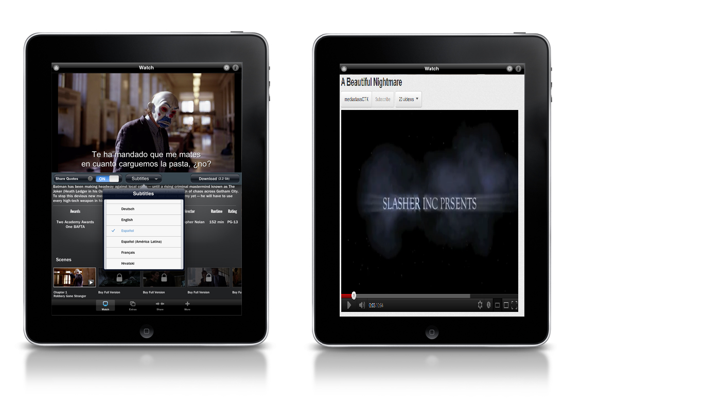
If you have a Blackberry, why not scan the image below. By scanning this image it will link your Blackberry to a ‘Slasher Inc’ page on BBM where you can be kept up to date with all the latest news about our movies release, give you the latest images associated with the movie and just lets you converse with us, the movies makers.
Elizabeth's response
Recently, over the years cross media convergence has been playing a significant part in how media gets to and is consumed by us. From the standard print media to the wide spread use of social networking sites like Facebook and Twitter, ‘Smartphones’ such as Blackberry and iPhone it has never been this easy to access information at such a fast rate.
When a producer wants to market a movie, social networking sites are one of the platforms targeted and these are all forms of viral marketing. The 2008 film directed, produced and co-written by Christopher Nolan ‘The Dark Knight’ was a very successful film as it was really good in terms of how and where the film was marketed. Cross media convergence and synergy was used effectively in promoting this film by creating a buzz between fans. In May 2007, a viral marketing campaign employed the ‘Why so serious?’ tagline on a wide scale with various websites constructed to interest fans. A year later in May 2008, a number of American theme parks opened The Dark Knight rollercoaster which simulates being stalked by the Joker. These rollercoaster’s cost a whopping $7.5 million to build up. The intelligent strategies used in the unique campaign made it a different experience and it definitely impressed the reported 10million participants!
Even in Britain too, limited editions of The Dark Knight themed game consoles were released (one of the ways synergy was used with the illustrious company Sony). Various competitions were giving out this device as a prize, thus promoting the film even more.
Print screen of the limited edition Dark Knight game console
A vast number of mobile phone themes were designed and many were even available for free download, which is of course is enticing to people.
Also on MySpace there was a Dark Knight take over and many backgrounds to choose from to customize your MySpace page.
Examples of The Dark Knight themed MySpace backgrounds
Another effective thing The Dark Knight used was having a number of various posters. By using this element it made it unique and much more enticing to the audience, making them curious as to what to expect next. Each of the posters has the batman logo on it which makes them recognisable to the audience.
Examples of some of The Dark Knight movie posters
After analysing the marketing and promotional techniques that was used for The Dark Knight, I know how important it is to promote and create a buzz about your film on a number of platforms. Evidently, it is very important for a film to invest in promotional means as this can have a massive impact on how successful the film is. As well as putting up our poster on billboards and buses, we decided that apps would be useful too as phones are mainly what people access the internet on these days (especially young people). By creating games, and other interactive apps like this it could get our film more recognition.
The 'A Beautiful Nightmare' app on a Blackberry Torch
The 'A Beautiful Nightmare' app on an iPhone 4s
Adeola's Response
When we began the coursework we had the idea that
all of our final pieces should have a corresponding link to one another. We
thought it would make the magazine and poster more successful in correspondence
to the trailer as it would not make sense if all three products had different
themes, images, costumes and props.This
would have led to a lack of continuity.
As part of our pre-production we decided as a group
to keep a flow of continuity throughout or products. As you can see the
magazine, poster and teaser trailer all use the same fonts.
For the poster, magazine and teaser
trailer we decided to use the colour red which connotes blood, evil and
mystery. We thought this would be effective for our product and ancillary text
based on the fact that we was producing a teaser trailer. As a background to our products we used the
colour black, we believed this would be effective due to the fact that black
connotes darkness and fear and that was our aim for our three final products.The rule of continuity was used throughout
other movies such as The Dark Knight which was Directed by Christopher Nolan
who worked alongside Writer Jonathan Nolan.
For our
ancillary texts the photographs were taken against a blue background. We had to
adjust the lighting to ensure that we achieved the black background we had set
out for. This was quite demanding at 1st but once we understood the
concept of how the lighting works it became simple to tackle. We had to ensure that we had a black
background because our teaser trailer was going to end with a black background as
the text ‘Beautiful Nightmare’ appears. To
ensure that our three final products worked together effectively we made sure
that the victim was wearing the same costume throughout (As seen in the image below).This made it easier for the audience to link
the final product and ancillary texts together.As seen in the Dark Knight promotion the batman theme was kept consistent
through all of their real media products.
The
variation of Platforms that were used for the Dark Knight’s promotion created a
buzz amongst the audience. During our pre-production planning we had came up
with a number of ways in which we thought would be effective.
Similarly
to the promotion of the Dark Knight which was distributed by Working Title, we thought it would help the release of our
film if he had an app for mobile phones. In this case it would be on the IPAD.
The Dark Knightwas a highly successful
film and this was mainly due to the different forms of promotion that they
used. This is known as cross media convergence, where different media formats
work together.In our everyday lives we
come across buses, billboard and posters at bus stops. I believe this is an
effective form of promotion because the public would be constantly reminded of
the media product. As a group we also
thought that it would be a good idea to have a production name so that the
potential audiences can make that link from Slasher Inc. to Beautiful
Nightmare.
Since
the Blackberry Android Smartphone came out they have become an increasingly
popular device. An android Smartphone is one where you can browse the internet,
talk to friends via BBM, listen to the radio and more.The Blackberry Smartphone would be an ideal platform
to promote our film based on the fact that our film is aimed at people aged 18+
and that is the same age group as those who use The Blackberry. We have created a few images as to what our
media product would look like on The Blackberry Smartphone.
The question for this evaluation question is 'what have you learned from your audience feedback?'
Harry's response;
Now that we have finished our Media productions (poster, magazine and teaser trailer) we can now gain information/feedback on what went well with our products and also what didn't go well.
Poster:
First of we have the movie poster. The poster is what would be used to advertise our movie in places such as bus stops and billboards etc. To gain some feedback the poster I used the social networking site Facebook - in order for people to comment or like, if they liked what they saw. The image below is what people thought about it
If you look at the image you can see quite clearly that people liked our poster. All the comments gave a good remark and the only negative was that someone said you could of looked a little bit more 'beaten-up' but again they said it worked very well. It also got 5 'likes' showing that 5 people indeed liked our poster. This has led me to the conclusion that were we to do the poster again I, personally, wouldn't change anything. As the saying goes 'don't fix what isn't broken' and as no negative comments were put up I learned that we done our poster very well
Magazine:
Now the magazine, on the other hand, didn't work anywhere as near good as the poster. Again, via the use of Facebook, I was able to get peoples opinion on the product on what worked well and what didn't work as well. If you look at the image below you can see what people thought of the magazine.
As you can see the magazine was not very well received at all. Each comment was a comment on ways in which we could of made the magazine better and no real comments about what worked well or what was actually good about the magazine. Also, if you look, you can see that no body pressed on the 'like' button. This shows me that no-one really liked the magazine. What I learned from this audience feedback is that had we have a chance to do the magazine again we would come with a completely different idea or just use the criticisms people had to our advantage and just switched up some of the work to suit what our audience we like.
Teaser trailer:
Now for our final product, our teaser trailer.
The way in which I collected feedback for this was a little bit different to the ways I collected it for the previous products. Again I used Facebook but I also let someone watch the trailer just to see their reaction and to tell whether it actually 'teased' or scared them. Watch the video below to see the reaction, from a fellow CTK student.
From watching over this video I can see clearly what worked and what didn't.
By looking at the video from 00:37 to 00:41 you can see that the student is genuinely horrified at the trailer. This made me learn that perhaps I should of involved more moments in the trailer which would of made someone watching it 'horrified'. His opinion was also very valuable. When he watched our teaser trailer we had presumed that the sound and editing was perfect but thanks to his feedback we learned that we were actually missing a vital component of our trailer! Without his feedback we may of forgotten to add it in and thus lost out on marks.
To gain a bit more feedback than just that from one student watching the clip and his reaction I also put the video on Facebook.
Opinions were generally favorable, apart from one comment which has stuck in my mind. This comment is the one which says "it was really light". This stuck in my mind as it has made me realize that perhaps our trailer was a bit too bright for that of a horror trailer as they're known for being very dark to promote fear. This has made me come to the conclusion that were I to do this project again I would go out of my way to make sure my trailer was a LOT more dark - so it fits into the horror genre seamlessly.
Also, the beauty of Facebook is that it allows friends to share your clips. This meant that some friends of mine were able to click the 'share' button and let their friends see it. This helped as it meant that their friends could then view and comment the video and as they wouldn't know me personally they would give opinions honestly and not just be kind because I am their friend. Below we have an image of my video link from my friends Facebook.
As you can see, many people liked it and even one person said they wanted to watch it due to the fact that it is 'very spooky'. This showed me that we (Slasher Inc) must of done a good job in our filming if people would actually want to go and see it.
In conclusion, my audience has showed me nothing more than the fact that 'you cannot please everyone' - by this I mean that some people will like you work whilst others will not be a fan of it. If I had another opportunity I would do a couple things different but overall I am very happy with the work I, and my group, created and I am glad people gave me their opinions on what worked well and what didn't.
Jouvans response: YouTube feedback
YouTube was a very useful internet technology we used to display our teaser trailer to our audience to view and to leave feedback on our teaser trailer. From our audience feedback we found on an overall the audience liked the teaser trailer as the majority of comments written were positive, for example one person made a comment saying that they liked the quick cuts and the captions used in the teaser trailer. We did however get some positive criticism from an individual who said the teaser trailer music could have been synchronised.
We also found from our like/dislike status bar that 6 people liked the teaser trailer and only one person disliked it. From this we can tell that the majority of people viewing our teaser trailer liked it in comparison to people disliking it which shows that our audience view our teaser trailer positively.
The above image shows the age group our teaser trailer is mostly watched by, from this information we found out that our audience is watched by younger people and this could be our target audience if we were to make an actual film from our teaser trailer. The image below shows that our teaser trailer is viewed mostly in Great Britain.