Showing posts with label Adeola. Show all posts

Tuesday, 21 February 2012

Magazine drafts

Second up is our magazine drafts.
These drafts were all done by Adeola, in hope of giving fellow group member Harry some inspiration and creative ideas when it came down to him creating the final magazine to promote our movie.
First magazine idea

Second magazine idea

Third magazine idea

Sunday, 8 January 2012

Adeola Horror Magazine Analysis


Scream is a UK horror magazine featuring articles from many different horror movies such as scream itself, nightmare on elm street and many more.

The target audience for this magazine would be horror movie fans preferably those over the age of 18. This is due to the fact that most horror movies are certified 18 and therefore their viewers will be of age 18 or over.

Denotation: The magazine consists of a red, green, white and orange theme. This rejects the traditional magazine colour scheme as they are normally only three colours.  The main image is of horror movie character Freddy Krueger with his signature blade glove. We see him through a medium shot showing his upper chest, shoulders and head. Although we cannot see his lower half it is quite clear that he is standing up. The setting  of the picture has similar stripes to that on Freddy Krueger’s jumper and the lower half of the setting seems to be an area with burning flames.  Above the main image is the masthead ‘scream’ in a rectangular box. In this box is the price of the magazine and the issue number.  On the left hand side of the magazine  there are three cover lines including actors from horror movies accompanied by their pictures. The pictures are all medium close up shots. The cover lines are all in yellow bold text followed my red text. In the left hand corner there is a barcode present as in all magazines. 


Masthead: ‘SCREAM’ is in bold white text. It has a green background. The masthead connotes death seeing as there is what seems to be dripping blood from the letters. The masthead itself connotes a sense of negativity based on the fact that people normally scream when they are in need of help. Across the centre of the masthead is four lines of blood, possibly a victim’s blood.  This yet again represents a insight of gory events to the audience. 


The main image of the magazine front cover is a medium shot of Freddy Krueger from Nightmare on Elm Street. His Costume is a green and red jumper with a black hat and a black blade glove. The characters NVC connotes disgust. We can see this through the facial expression that he gives off to the audience. He is looking directly at the audience almost as though we are the victim, this effectively creates a sense of fear which is the aim for a horror magazine. The fact that the hand with the blade is visible whilst his other hand is not visible gives the audience a clear idea that the main focus of the magazine is slash horror. There is also a trail of blood leading from top of the magazine towards the blade almost as though it was used on a victim. The black hat that Freddy Krueger is wearing connotes mystery. This could be the mystery of the events that are due to take place in the movie or the mystery as to wear the blood on the blade originated from.  The characters face in the main image also looks burnt which relates to the flames in the background of the magazine front cover.


The tagline ‘Blood, Guts, Gore & More’ gives the audience awareness that it is a slash horror working alongside with the main image.  The Tagline connotes that there is due to be a lot of bloody, gory and horrific events. The use of the words Guts and Gore presents linguistic techniques such as alliteration.  


Positioned in the top left hand corner was the internet link for the magazine. This would enable readers to view the magazine’s webpage online and look at any additional articles that may not have been published in the magazine.

Adeola Horror Poster Analysis


Movie Title: Halloween
Year of Release: 2007
Director: Rob Zombie
Production by: Dimension Films. Nightfall Productions and Spectacle Entertainment Group
Actors: Scout Taylor-Compton, Malcolm McDowell and Tyler Mane


Synopsis: Michael Myers, a grown and dangerous man, escapes from the mental institution having being committed for 17 years. He was committed to the mental institution as a 10 year old. After his escape, he immediately returns to Haddonfield, where he is on a quest to find his baby sister, Laurie. Anyone who crosses his path is in mortal danger.

Budget: $15,000,000 (estimated)
Opening Weekend: $30,591,759 (USA) (2 September 2007) (3472 Screens)
Gross: $80,253,908 (Worldwide)

Target audience:  Halloween seems to be a clash between zombie and slash horror. The ideal target audience would be those of age 18-23. This is due to the fact that the age is 18 certificate and those above the age of 18 will not be affected by the negative connotation of Halloween that the movie will portray.

Denotation:
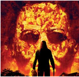
In the magazine poster there is an outline of a face which features different activities varying from two people fighting to the face of a clown. The face is in bright orange with a brown shadow surfacing. We see this face through  close up shot. Looking directly at the face with a back to the audience is a male figure holding a knife and a head. This character is wearing all black and we witness this through the use of a long shot . In the background of the poster we are introduced to a house which looks to have been burning and particles of waste on the left hand side next to the house. This is believed to be in the woods.  At the bottom of the poster there is the release date and above that is the title of the movie. At the top centre of the poster is the tag line.

Connotation:


The title of the movie is ‘Halloween’. On the poster the word Halloween is in bright yellow and orange block writing. The use of the orange and yellow text connotes fire and flames. This corresponds with the genre of horror in which the movie is. ‘Halloween’ is a zombie horror meaning risen from the dead.  It is common for people to die in fires and this represents a link between the genre of horror and the colours used in the text. The use of the orange and yellow text also represents Halloween itself. Halloween pumpkins and lights are always orange so the text was creatively and effectively done. 


Props:  The knife and head in the characters hand connotes death.  The representation that we receive from the knife in the context of the movie is that it is the killers main weapon. Knifes and blades are commonly used in slash horrors and often present gory content.  The head in the characters hand also makes the audience aware that he is the killer in the movie. We are not introduced this characters identity. 


The tagline ‘EVIL HAS A DESTINY’ connotes that many negative events are going to take place. Destiny means ‘events that will happen to a person or thing in the future’ and this corresponds with the events that are framed in the outline of the face. As the character is walking towards this face, he is walking towards all the evil events that are due to occur and he is going to play a huge role within these events.  

Setting: There is little setting  although in the poster it seems to be the woods where there is a burnt out house. This yet again links to the theory of burning and zombies. 


Lighting:  The lighting used towards the lower area of the poster is low key. I believe this was done to contrast with the text of the title and make it stand out. Low key lighting is often used in horror movies to create a sense of fear amongst its audience.  Although the upper half of the poster uses bright colours it is still dim and therefore low key. If high key lighting was used then it would take away from the effectiveness needed to create a horror poster.  

Costume: The character is dressed in all black, which seems to be a leather jacket and trousers. The colour black connotes alienation, hate and depression. These feeling would all correspond to his role within the movie as the killer.  The characters composition is stern and upright, almost as though he is about to begin a mission.

Research into Media Regulation

Media Content Regulation in the UK revolves primarily around Codes of Practice, drawn up by a variety of bodies which are either entirely or largely independant. In some cases, these Codes of Practice have been developed by bodies with statutory powers over the media while in others the responsible bodies have been established by the media or journalists themselves. Media Regulation also refers to the terms and conditions in which a meduia product is released. If these terms and conditions are not followed then the necessary action will take place.

The Press Complaints Commission (PCC) is a voluntary regulatory body for British printed newspapers and magazines, consisting of representatives of the major publishers. The PCC have no legal powers so therefore all newspapers and magazines voluntarily contribute to the costs of, and adhere to the rulings of the commission make the industry self regulatory.


It is evident that the PCC (Press Complaints Commission) are in need of reform seeing as the phone hacking scandal took place. The PCC are where people go if they have a complaint about a certain item that has been published. The PCC have the power to prevent newspaper companies from publishing articles on a given topic but this is after a complaint has been made. It is believed that the PCC have the public's best interest at heart but it is proven that they are not very effective.Once an article has been published the damage has been done so there needs to be higher security and requirment levels to ensue the public needs are met.

In 2009 the PCC received more than 25,000 complaints. These complaints came about after an article appeared in the Daily Mail written by Jan Moir about the death of Boyzone singer Stephen Gately. Moir had described events leading up the death as 'sleazy' and 'less than respectable'.
On the 17th February the PCC confirmed that although it was 'uncomfortable with the tenor of the columnists remarks' it would not uphold the complaints made. The Guardian newspaper also rejected that social media are to be bought under the remit of the PCC after it ruled in February 2011 that information posted on twitter should be considered public and publishable by newspapers.

The code of practice is used when members of the commission adjudicate whether the code has indee been broken, and, if so, suggest appropriate measures of correction. Many publishers have added clauses the contracts of editors of newspapers and magazines giving them the option to dismiss editors who are judged to have breached the PCC Code of Practice.

One example of the ineffectiveness of the PCC is the phone hacking scandal. The phone hacking scandal that took place recently involved news international. On the 11th June 2005 a royal correspondant, Clive Goodman wrote a story about medical treatment that Prince William received. It was sure that this information had been leaked seeing as only close relatives and friends of the Prince knew this information. This led to suspicion of interference with voicemail. The phone hacking scandal proved that the PCC doesn't have the necessary powers to prevent things like this from occuring. The PCC received extensive criticism for its lack of action in the news of the world phone hacking affair, including MPs and Prime Minister David Cameron, who called for it to be replaced with a new system in July 2011.


The Ryan Giggs case is a perfect example of the problem of regulation in the digital age. A large number of celebrities have taken out injunctions against newspapers in a bid to prevent them from printing stories about them. Some newspapers or broadcasters in other territories might decide to repoty the case as the injunction does not apply overseas. Because of this it is easy via google to find out the details that the newspapers have been prevented from printing. This is one of the ways in which the PCC are effective because they enable injunctions but it could be seen that they are in need of more power due to the fact the information can still be published online.

Improving the PCC will take a lot of enhanced responsibility that should be guaranteed to the public. One of the ways in which the PCC could be reformed would be to state strict levels of requirments that publishing companies must follow and if they dont abide by these requirments then a fine will be imposed. This would be an effective measure because it means that unsolicited articles will not be published and it would hopefully decrease the amount of complaints that the PCC receive.

I am fully aware that in order to reform the PCC they would need to go through many legislations in order to gain the new investigatory powers. These powers will enable the PCC to get to the bottom of stories which include very expensive individuals such as Rupert Murdoch. With these powers it will decrease the newspaper companies freedom to release articles containing information that could be seen as inappropriate. Not only would this protect people's privacy but it would protect large companies and businesses as a whole.

Pre-production research

During our horror movie trailer production we will need to create fake cuts and bruises in order to create a sense of realism and effect. As a group we have researched on you tube different videos that aid the making of a fake cut.

Health and Safety:

  • Before you begin to make a fake cut it is always important to ensure that you are aware of the necessary health and safety measures. Some people may have a reaction to the latex used so it is always important to make sure that you test a small amount on your hand and leave for a while to ensure it is safe to use elsewhere.
  • It is also important to make sure that you wash your hands before the making of a fake scar. This is because you carry bacteria on your hands all day and you don't want it to be transmitted. It would also help if gloves where worn during the process.
Items used: 
  • Liquid Latex
  • Scar Wax
  • Spirit Gum
  • Fake Blood
  • Spatula
  • Cotton Bud
Application for the fake scar:

  • Before you begin this process ensure that you have tested the liquid latex on a small area of skin to ensure your body wont react negatively to the substance. 
  • Once you have done this get a cotton bud and some liquid latex, dip the cotton bud in the liquid latex and apply to the area of skin in which you want the scar to be. 
  • Wait for the first layer of liquid latex to dry. Once this layer has dried you can then add another layer of liquid latex. 
  • After the second layer of liquid latex has dried apply the spirit gum adhesive.
  • You can then use a spatula to apply the scar wax above the layer of spirit gum adhesive.
  • In order to create a simple cut you can use the tip of the spatula and indent the middle of the scar wax either vertically or horizontally.
  • To ensure that the scar stays on the surface area needed we then have to add an additional layer liquid latex.
  • You then have to use the appropriate make up powder to remove some of the shine and also apply foundation around the edges of the scar to blend it into the skin.
  • Once you have completed all of the above steps you can then customise your scar to create the effect that you want.
  • You can use fake blood to create the redness of the scar and also brown and blue paint to create a bruise effect.


Items used:
  • Bruise Wheel by Ben Nye
  • Sponge (preferably a make up sponge)
Application for the fake scar:
  • Begin application with the lighter colour being green . Dab it around using the sponge to the area in which you want to bruise to be. 
  • Do this unevenly to create a sense of realism.
  • The next colour to apply from the bruise wheel would be the purple. 
  • Simple application of the purple colouring above the green layer creates the colouring needed for an effective bruise.
  • You can then add the blue and as you go along you can add more green so it doesn't look like you threw different colours above each other.
  • Finally you can add the dark brown colour which is the main colour for a bruise.
  • Ensure that when you apply the colours you don't do so with a pattern e.g. a circle, seeing as this will take away from the effectiveness.

Monday, 12 December 2011

Setting up a tripod


This video shows our team member Jouvan setting up a tripod step by step.  A tripod is an important tool when using a camera as it is adjustable and it helps you support the camera.

Monday, 28 November 2011

Adeola's Horror movie review


Nightmare on Elm street

The horror movie in which I reviewed featured 'Freddy Kruiger' who has featured in some of the most successful horror movies such as 'Freddy vs Jason'. Similarly to our horror trailer Nightmare On Elm Street is a slasher horror and is also the inspiration for our trailer. The poster of the movie also helps indicate this as his hand is a blade. One of the key scenes in the movie show a female victim which is common in horror. A sequence of events happen in her life as though it where a dream when really it was a gruesome reality. I enjoyed the film because it made me jump and I believe this characterisitc represents a succesful horror. I would score 'Nightmare On Elm Street' a 4 out of 5 due to the fact that it follows many of the horror conventions such as a female protaganist. I would not score the movie 5 out of 5 on the basis that it was like a typical horror and could have had a slight variation.

Sunday, 20 November 2011

Preliminary Shooting Task


In order to prepare for the filming of our horror teaser trailer, I filmed my little sister making tea. I used cuts, different camera angles and worked with lighting. This was just a rough task to give me a rough idea of filming.